What makes a great research poster?
Source: What makes a great research poster — on YouTube
- Obvious Flow
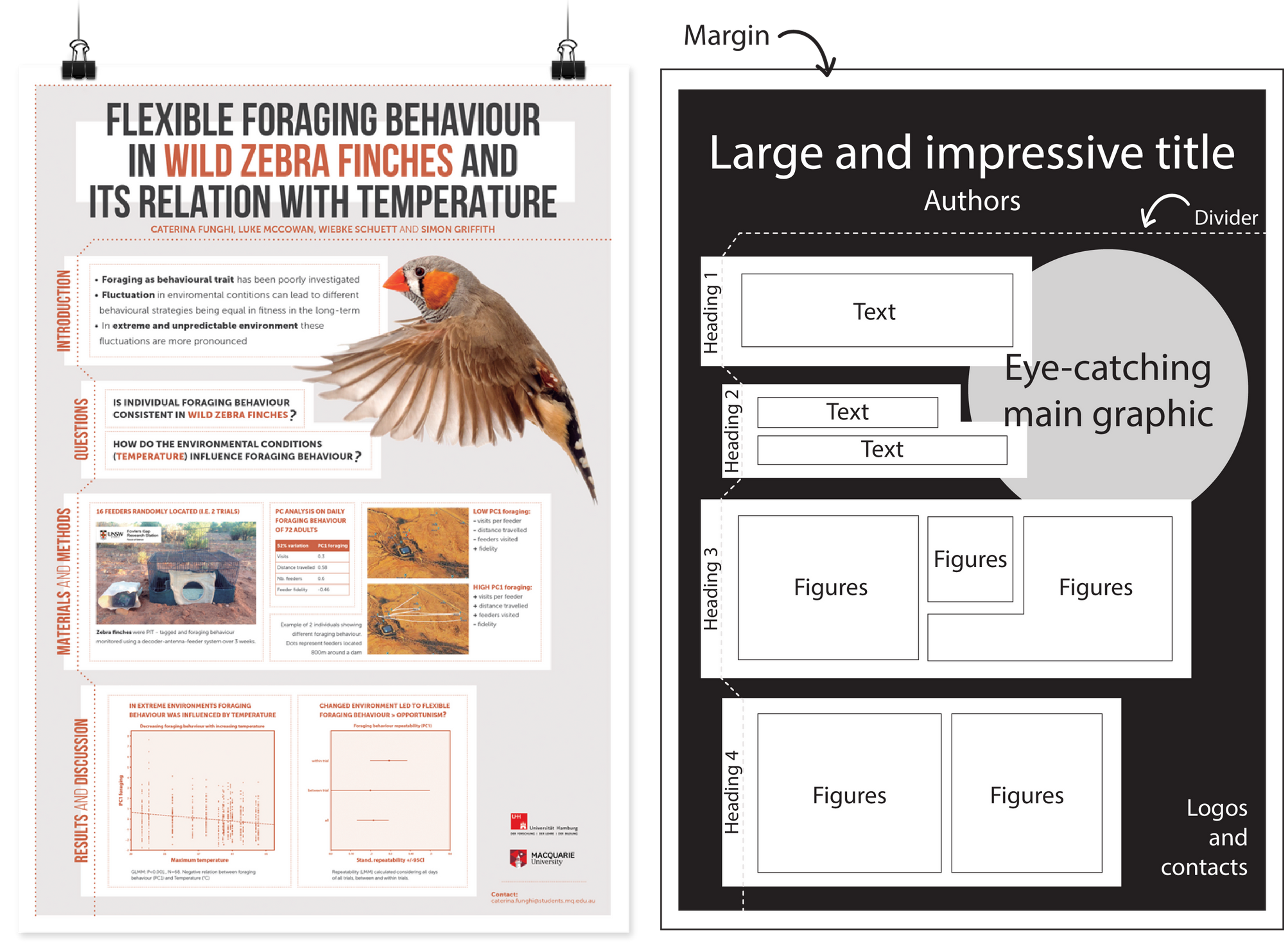
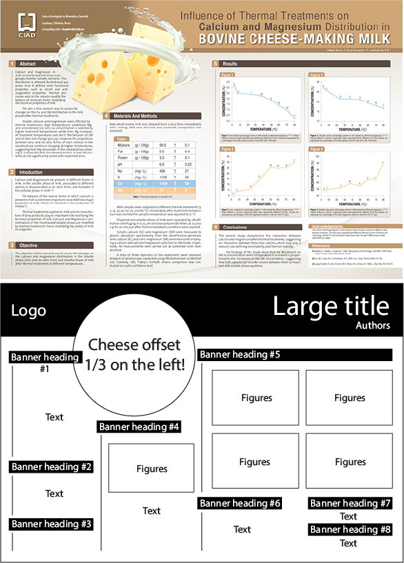
- Background → Method → Measures → Results → Conclusion
- Column Structure
- Less text, more figures and graphs
- Less color
- Do not make it too colorful
How to design an award winning conference poster?
Source: How to design an award winning conference poster?
- What a poster is:
- Above all, a poster should be a networking tool. The primary purpose of a poster is not to communicate every little detail of your fantastic research, but rather to attract people’s attention and serve as a conversation starter, but it is not going to do the talking for you.
- The key information you’d include in your poster is the same information that you’d find in any scientific abstract. A poster is a graphical abstract — a concise and visual summary of your research.
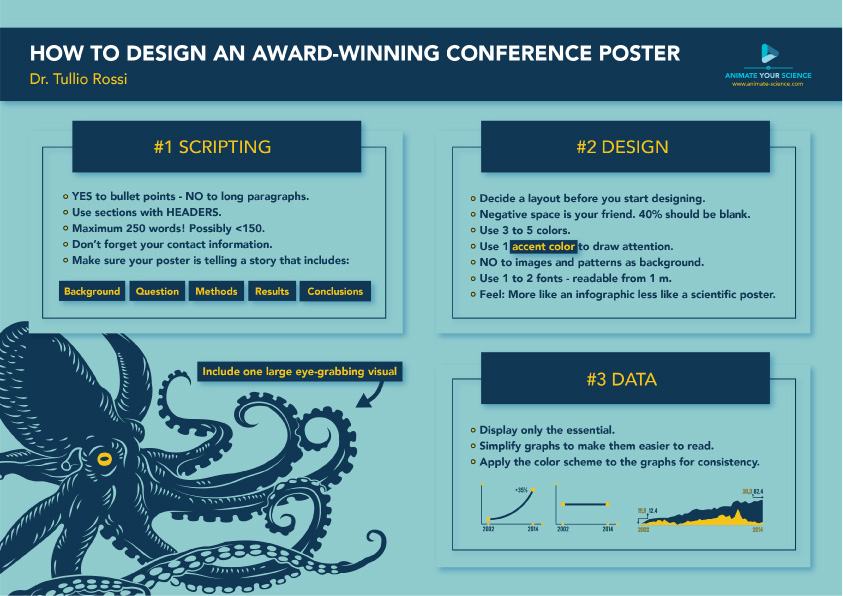
- Step 1 — Scripting
- Target audience. Ask yourself, who is my ideal audience for this poster? Is it other experts in the field, or perhaps the broader public?
- Bullet points. A poster should not look like a paper, therefore, bullet points are your friend.
- Sections with headers.
- Background → Questions / knowledge gap → Methods (keep it to the bare minimum or skip it if you can) → Results → Conclusions → References and acknowledgments (smaller at the bottom)
- Less words. Keep the word count under 250 in total. Possibly < 150 words.
- Graphs. Carefully select only the very essentials. 1-2 graphs is better than 3-4.
- Step 2 — Concept
- Step 3 — Design
- Contact information. Put a QR code to Twitter profile or LinkedIn. Even better, put a few business cards or a miniature A4 version of the poster (with contact info) beside the poster for people to take.
- Photo. Most people don’t even think about this, but it’s a good idea to put a photo of you in one of the lower corners of your poster near your contact info. It makes the poster more human and allow people to identify you.
Examples: